Book Cover Tips to Best Reach Your Reader
-
Jill Maxick
- Reading Time: 7 Minutes
SHARE
Learn how to design, or choose, a successful book cover by understanding your target reader, positioning your book correctly, and following key design best practices to ensure your book stands out—and fits in—on shelves and online.
The adage “never judge a book by its cover” is unhelpful in book publishing. As product packaging, the point of a book’s cover is to allow people to quickly and accurately judge the contents and assess whether it might be a book they’d like or will suit their needs. (After that need is met, consider if it’s aesthetically pleasing.)
POSITIONING
Not reaching the right reader, or reaching the wrong one, are problems that can be mitigated by carefully positioning your book. Positioning is a marketing strategy that helps a book identify and reach its target readers. Many books have more than one audience. But a mispositioned book can disappoint the wrong readers or get lost in the marketplace, never reaching the right ones.
Cover design is a vital element of positioning a book (along with titling, price, format, cover copy, and categorization, among others.)
If your book looks like a historical novel but the story is contemporary, like mystery when it’s women’s fiction, or a nonfiction memoir looks like a novel, readers who select it under false assessment may be let down when reality doesn’t meet expectations. Worse, the most interested potential readers may not even discover it.
KNOW YOUR READER(S)
Knowing who your readers are is the foundation of any successful book marketing campaign, and the book cover is a marketing tool. Before you entertain cover design, you should know who is most likely to want to read your book and for whom you have primarily written it. (“Everybody” is not a valid answer.)
The most important rule for a book cover design?
LOOK LIKE THE SHELF YOU BELONG ON (yet also stand out)
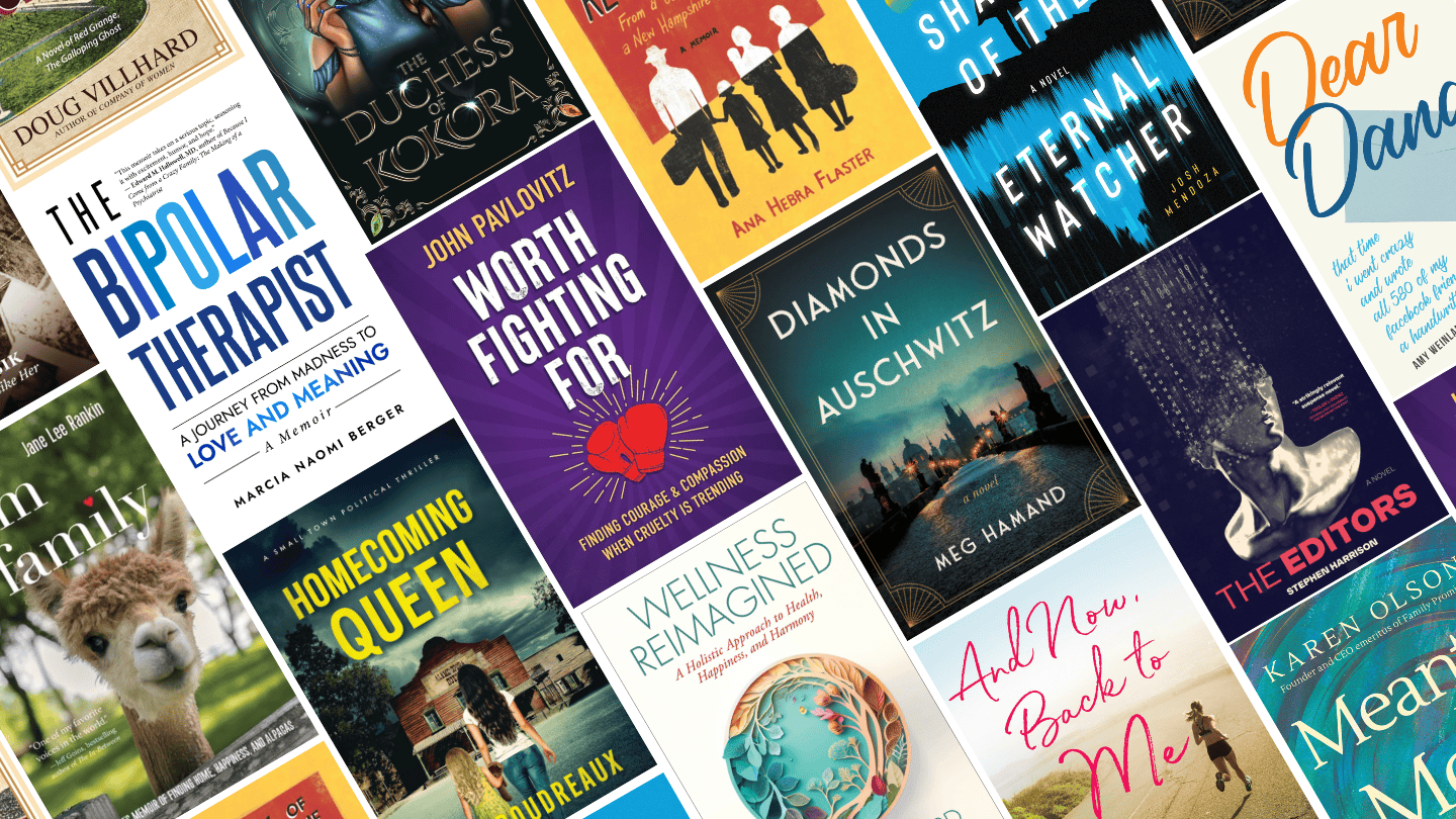
This adage is vital. Here, shelf is both literal (a section in a store or library) and virtual (an online category, list, or search results). Contemporary should not look historical, fiction should not look like nonfiction, and every nonfiction category or fiction genre (including subgenres) has style elements that are both in vogue and identifiable.
Stroll through a bookstore and scroll through one online to thoroughly review current titles that are most comparable to your own. Comp titles should be recent (within the past 2 years) and reasonable (don’t choose category all-stars like Harry Potter or What to Expect When You’re Expecting).
Note the differentiators: What design elements do recent cookbooks or self-help books all have that other types of books do not? What colors, size and type of font, illustrations or images make a successful book stand out amongst its category peers?
Note the commonalities: What marks a current romance novel? In recent years, the romance category has consistently preferred bright, colorful colors with graphic illustrations of characters. Using that style on a book that’s not romance would be poor positioning. And if you don’t use that style on a book that rightfully belongs on that shelf, you run the risk of confusing or missing your target readers (especially if you instead use a style that’s associated with a different shelf or type of book).
COVER DESIGN BEST PRACTICES
The appeal of any cover to readers is subjective, but as product packaging they must follow some best practices and the tenets of good graphic design: not using too many fonts or colors; being legible; being coherent; properly using kerning, shadows, line spacing, and the like. (See “hire a pro” below.)
Ensure your cover includes all necessary information, whether that’s a relevant author credential (a medical doctor writing health/self-help); an explanatory subtitle; a review pull quote or value-add endorsement; a compelling tagline; a genre identifier, if needed (“A Novel”, “A Memoir”) and a consistently written author name (use of hyphens, nicknames, or middle initials should be the same everywhere.)
Consider how your cover will be viewed:
- In a physical store, most books are displayed spine out, not front cover-facing. Do not neglect the spine! It should be legible, eye-catching, contain the necessary title/author information, and complement the look of the rest of the cover.
- Online, your book may be viewed as a small thumbnail when it comes up in search results. The image and text needs to be legible and render well in this size as well as full book size, so view it both ways when evaluating a design. Do this on cellphones and mobile devices as well as a computer screen.
HIRE A PRO
Using an experienced book cover designer is paramount. Not only will they have more experience with the niche elements of book design (flaps, spines, bar codes, etc.), but professional designers don’t design purely on their personal taste. Although their aesthetic does come into play, they will approach design with a book’s positioning in mind, using that to make an attractive, standout cover that works.
Bottom line: know your target reader, know the books that are currently being marketed to them, view your cover like they will, and you’ll judge a book’s cover successfully.
A great cover is just the beginning of your book’s success story. Positioning, visibility, and reaching the right readers all work hand in hand—and that’s where we come in. Our book publicity services are designed to help you stand out in a crowded market and get the attention your book deserves. Contact us to learn how we can help.
Looking to learn more about book positioning? Check out:
Understanding BISAC Codes: How to Make Them Work for You

Jill Maxick

Books for Every Reader: Our 2025 Gift Guide
Books for Every Reader: Our 2025 Gift Guide SHARE The
11 Creative Ways to Bring Your Backlist Back to Life
11 Creative Ways to Bring Your Backlist Back to Life

Get Swept Away this Fall at the Texas Book Festival 2025
Get Swept Away this Fall at the Texas Book Festival